
OVERVIEW
Founded by Matt Medina, Novo Barbers has rapidly grown from one local shop to five locations across Colorado in less than five years. Matt's dedication to delivering a unique grooming experience has made Novo Barbers a premier destination for clients seeking exceptional service in the Denver area.
background
Novo Barber's rapid growth over the last five years led to a complete website redesign with a new booking system. I took charge of the design project to ensure that it aligned with the business's objectives, improved customer engagement, and increased booking efficiency for the owner and the barbers.
outcome
After launching the updated site, we saw a resulting in over ~50% increase in user engagement and a 25% rise in appointment clicks compared with previous years, demonstrating the significant impact of our UX and UI enhancements.
info
Role: UX/UI designer Lead, Researcher
Team: 1 Jr UX designer and myself
Timeline: 10 weeks
Tools: Whimsical, Miro, Figma, Wix
TACKLING THE PROBLEM
How might we redesign the website to enhance user engagement and accessibility, making it intuitive and visually appealing while seamlessly integrating a new booking system that simplifies scheduling for Novo's clients and Barbers?
Clear call-to-action
We strategically placed clear and consistent CTAs throughout the website, guiding users through an intuitive booking process. This streamlined the user journey, making it effortless to schedule appointments.
Increase user traffic
We boosted bookings by strategically directing users to explore other site areas, using targeted content and CTAs that seamlessly guide them back to the booking process.
Lack of accessibility
The website did not meet modern accessibility standards, limiting its usability for all users.
HYPOTHESIS
Simplifying the booking process and enhancing the presentation of Novo's locations and barbers' backgrounds will significantly improve the user experience. By streamlining these areas, users will find it easier to book appointments and better understand Novo Barbers' services, leading to increased engagement and satisfaction. These improvements are expected to make the process more intuitive, fostering trust in Novo's services and driving more repeat bookings and customer loyalty.
RESEARCH APPROACH
Taking a user-centric approach, we addressed Novo Barbers' challenges by thoroughly understanding the customers' and stakeholders' needs and preferences. Through competitive analysis, user research, and on-site observations, I gained key insights that informed the creation of personas, information architecture, and customer journeys, which became the foundation of our proposed solution.
Competitive Analysis
I conducted a competitive analysis for the Novo Barbers website redesign to evaluate industry standards and identify best practices. We examined competitors' websites to assess their booking processes; user flows, and overall design aesthetics.
This analysis highlighted areas where Novo could differentiate itself, such as offering a more streamlined booking experience and a clearer presentation of barbers' profiles and locations.

SWOT
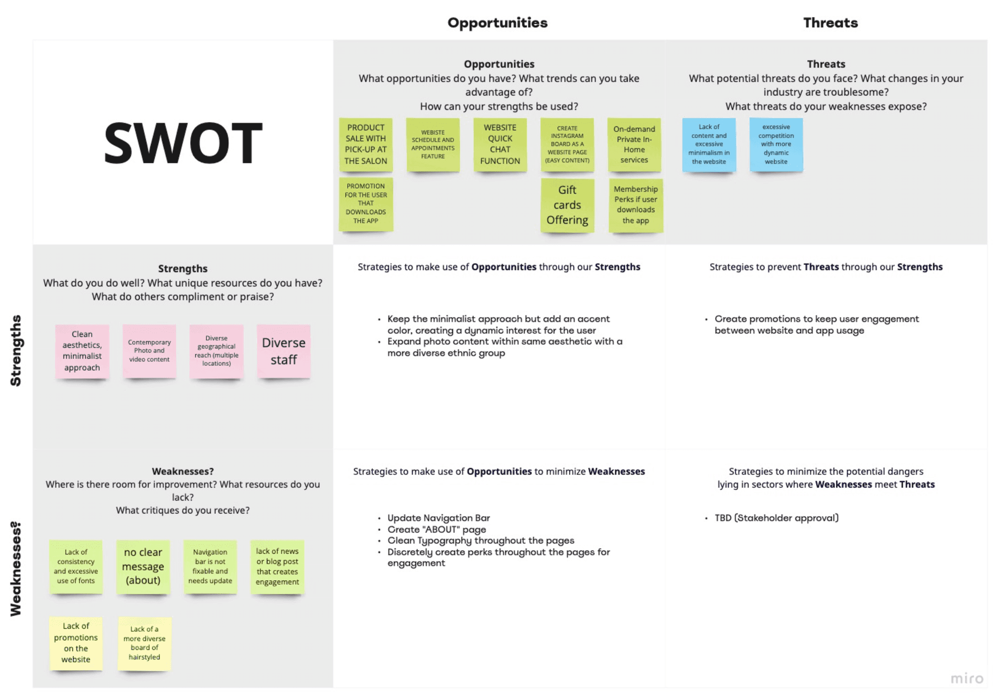
As part of the research, I also conducted a SWOT analysis to identify internal strengths and weaknesses and external opportunities and threats.
Strengths: Strong brand reputation and loyal customer base
Weaknesses: The existing website has a complicated booking process and lacks clear location information about locations and barbers' background
Opportunities: The potential to attract new customers by connecting with social media accounts to improve online visibility
Threats: Competitors with more modern, user-friendly websites that could draw away potential clients
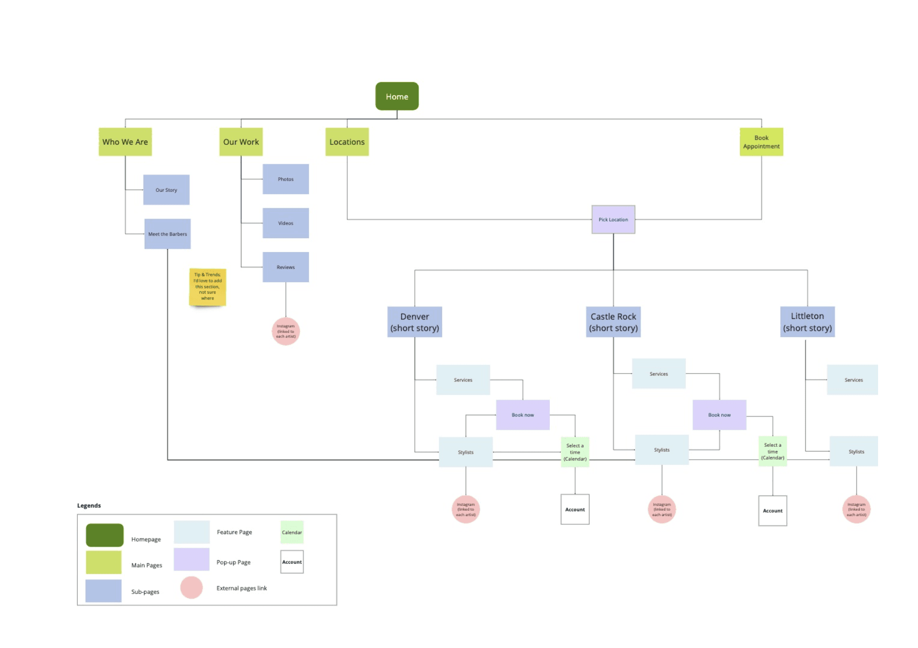
Sitemap
Novo's sitemap includes key sections like Home, Our Work, Locations, and Book Appointment. This structure provides a clear and intuitive pathway for users to explore services, book appointments, and engage with the barbers.
Problems with the previous website
Top navigation bar issues
The top navigation bar is not fixed, causing it to disappear when users scroll. This hampers easy navigation, as users must scroll back up to access it.
Unintuitive structure and layout
The website’s structure and layout are not intuitive, leading to a confusing user journey that detracts from the overall user experience.
Missing important information
Important details, such as contact information, are not readily accessible, frustrating users trying to find basic information quickly.
Lack of storytelling and testimonials
No section is dedicated to showcasing Novo Barber’s story, customer testimonials, or background information about the barbers and hairstylists, which could help build trust and connect with potential clients.
Absence of clear CTA
The site's lack of a clear call-to-action button, specifically one directing users to ‘book an appointment,’ is a missed opportunity. With guidance for different locations, this could significantly improve the user experience and make it easier for users to take immediate action.

Metrics
In the first iteration of the low-fidelity wireframes, I designed polls that allow voters to respond with more than one vote, offering both multi-select polls and single-choice polls.
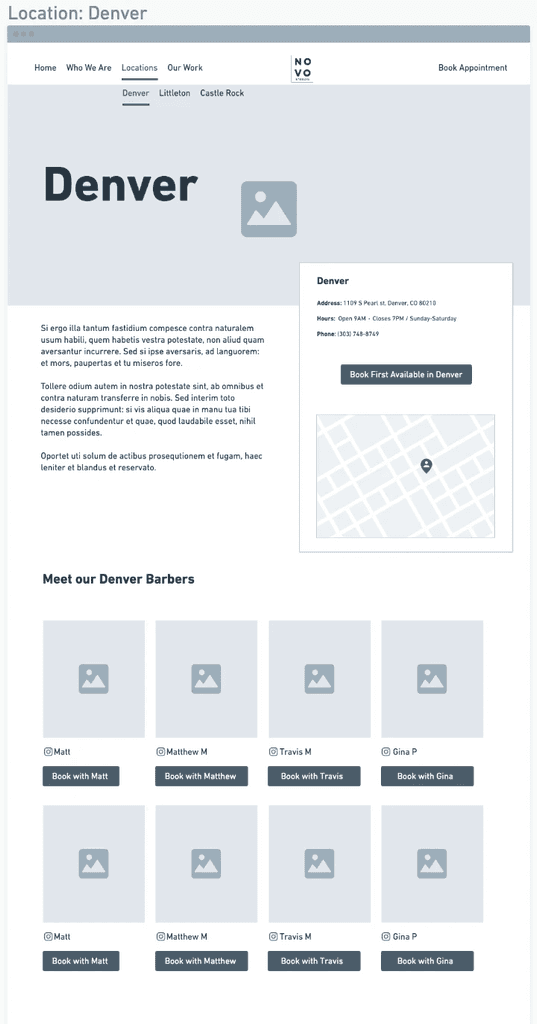
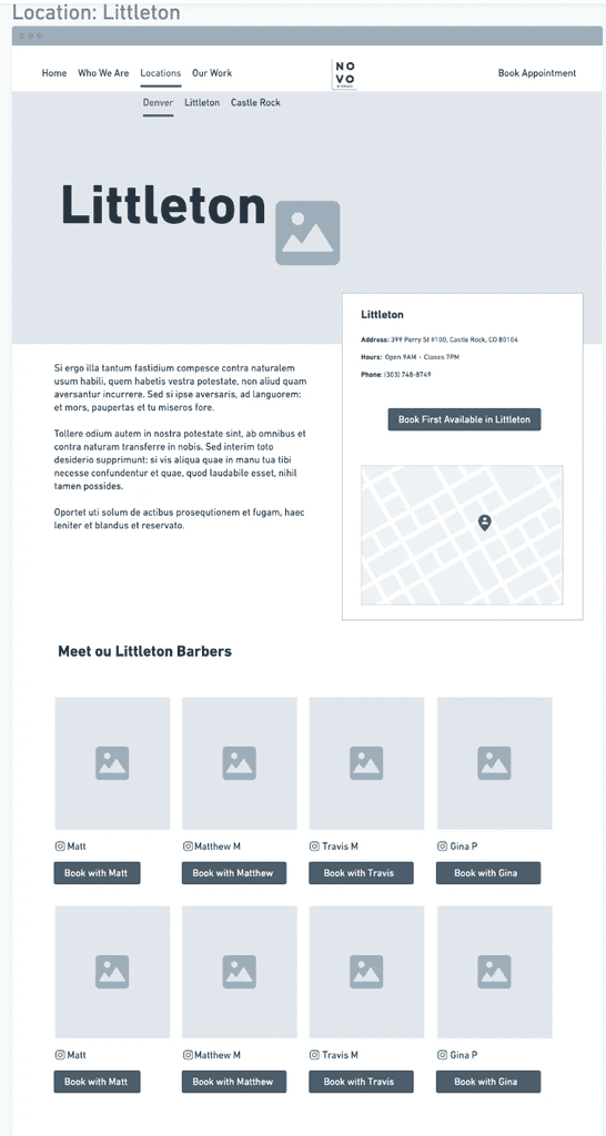
Wireframes
After much consideration and discussions with the Engineering team, we've decided to de-scope the multi-choice polls feature. Implementing this would significantly extend the design and coding phases, and we want to ensure that the project stays on track with our originally planned timeline.

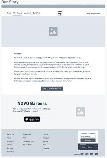
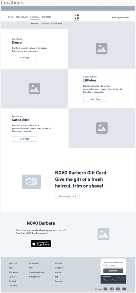

High fidelity prototypes
After much consideration and discussions with the Engineering team, we've decided to de-scope the multi-choice polls feature. Implementing this would significantly extend the design and coding phases, and we want to ensure that the project stays on track with our originally planned timeline.
/nileybarros 2024
polls post-type