Olive Health App
OVERVIEW: Olive App is a responsive health app that provides users a reliable and healthy way to learn about foods, recipes and engage with the community and health experts.
GOALS: Olive will teach users how to eat better, healthier, and make nutritious recipes daily. Users will have easy access to recipes, video recipes and have a chance to chat with experts through the app.
RESPONSIBILITIES: Solo project: UX/UI Designer and Researcher
TOOLS: Figma, Adobe Illustrator, Canva, Miro, Optimal Sort, UsabilityHub, Balsamiq, Google Forms, Keynote, Zoom, Post-Its, Paper & Pen
DISCOVERY
- Interviewed five participants through a cognitive walkthrough of the app
- Determine users position on eating healthier
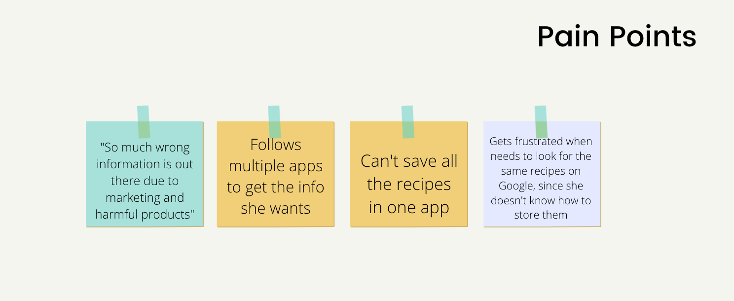
- Identify users' pain points using health-related apps
- Discover how users feel about using the app to scan products at the grocery store; learning more about everything the food they purchase
- Discover how users feel about having a community in the app for experience sharing, support, and learning
- Understand if users would like a health app not only focused on losing weight
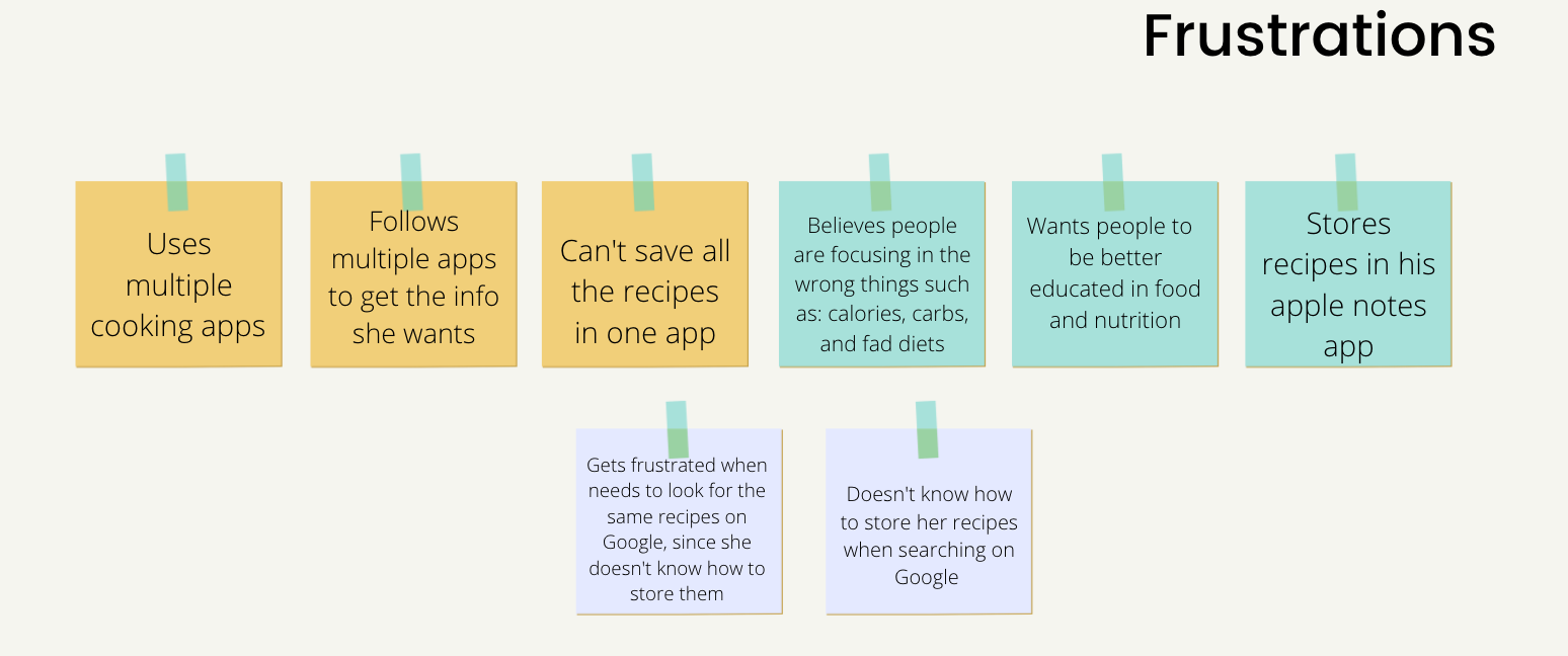
- Learning the users' main frustrations was to use multiple apps to learn about health, recipes, and exercises
USER PERSONAS AND JOURNEY MAP
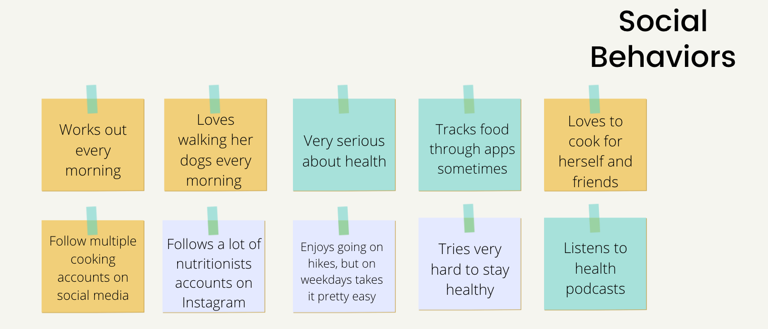
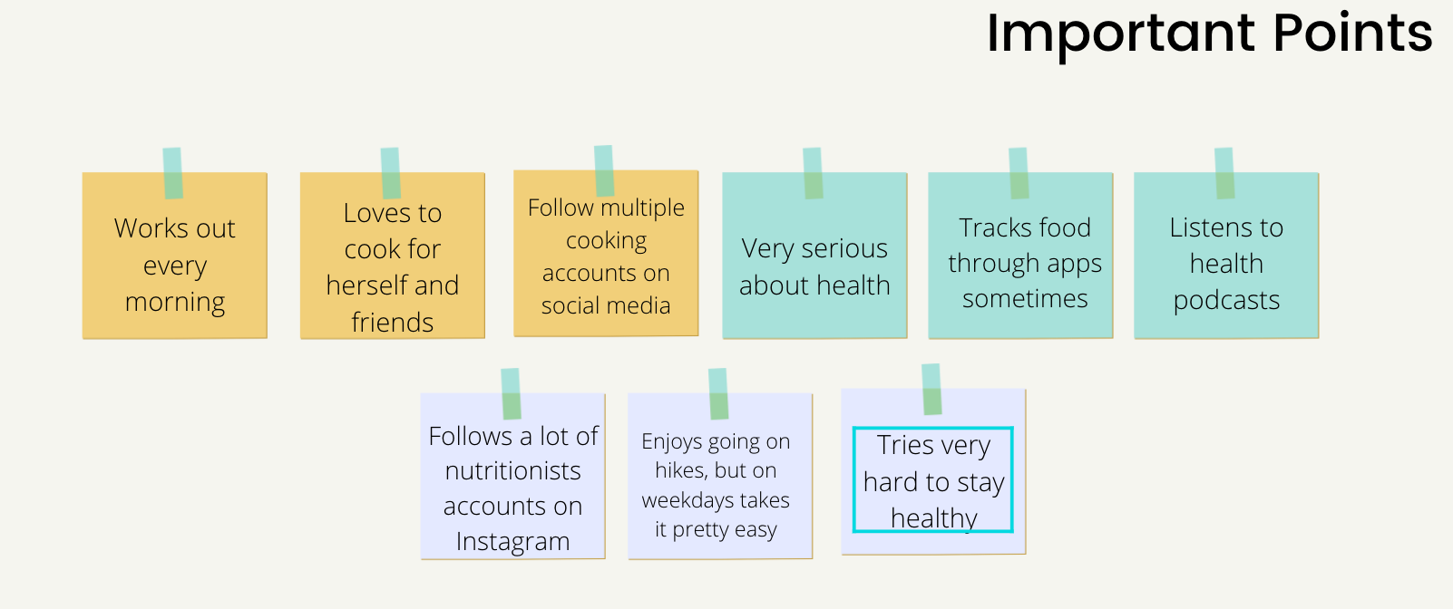
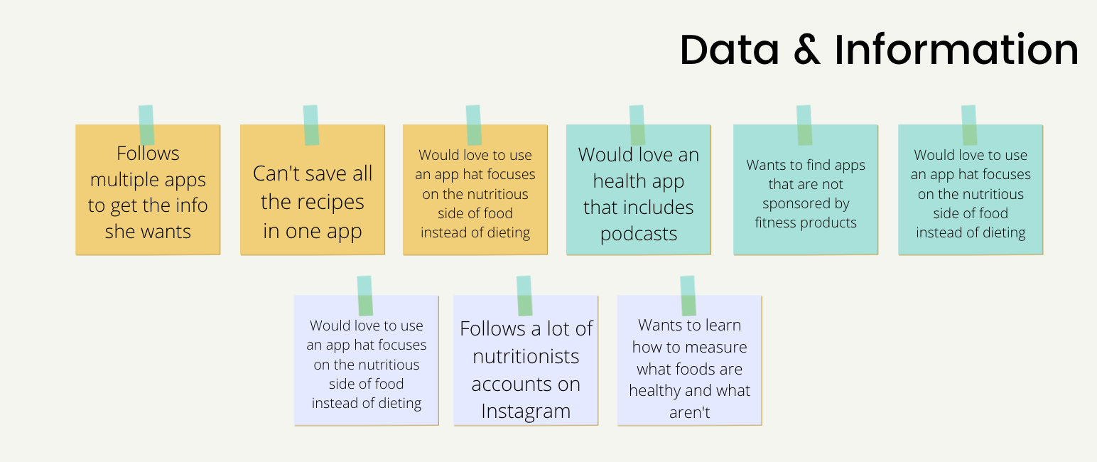
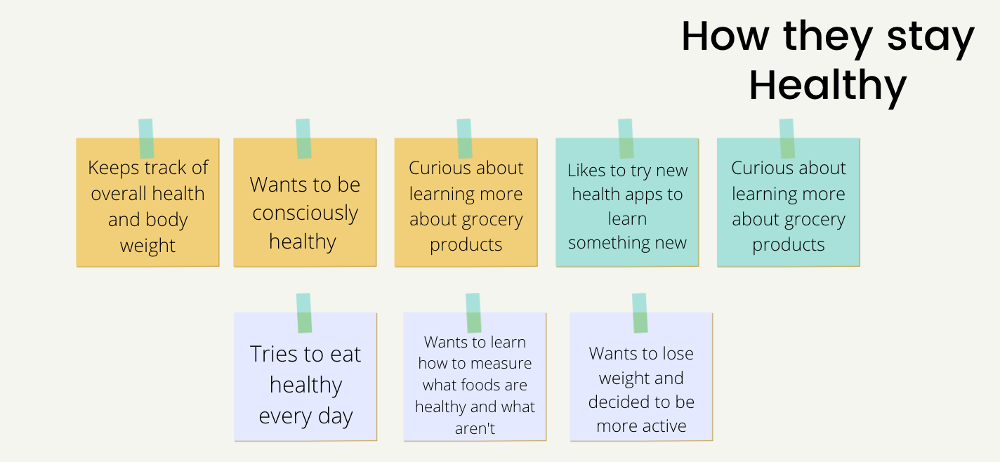
- Olive has two primary personas, a busy mom and a person with diabetes
- Sarah, the busy mom, wants to eat healthier and have easy access to recipes for herself and her family
- Albert, a lifelong diabetic, wants to use the app to eat healthier and control his diabetes since he often needs to give updates to his doctor
- Both want to have easy access to recipes and shop the right food for their diet at the grocery
CARD SORT
- Used OptimalSort card sort
- Delivered open card sorts to twelve participants - eleven participants completed
- Twenty cards, including original categories from iteration one
- Delivered open card sorts to twelve participants - eleven participants completed
- Twenty cards, including original categories from iteration one
ORIGINAL SITEMAP
REVISED SITEMAP
LOW FIDELITY WIREFRAMES
- Sitemap and competitor analysis successfully finalized
- First wireframes created
- First wireframes created
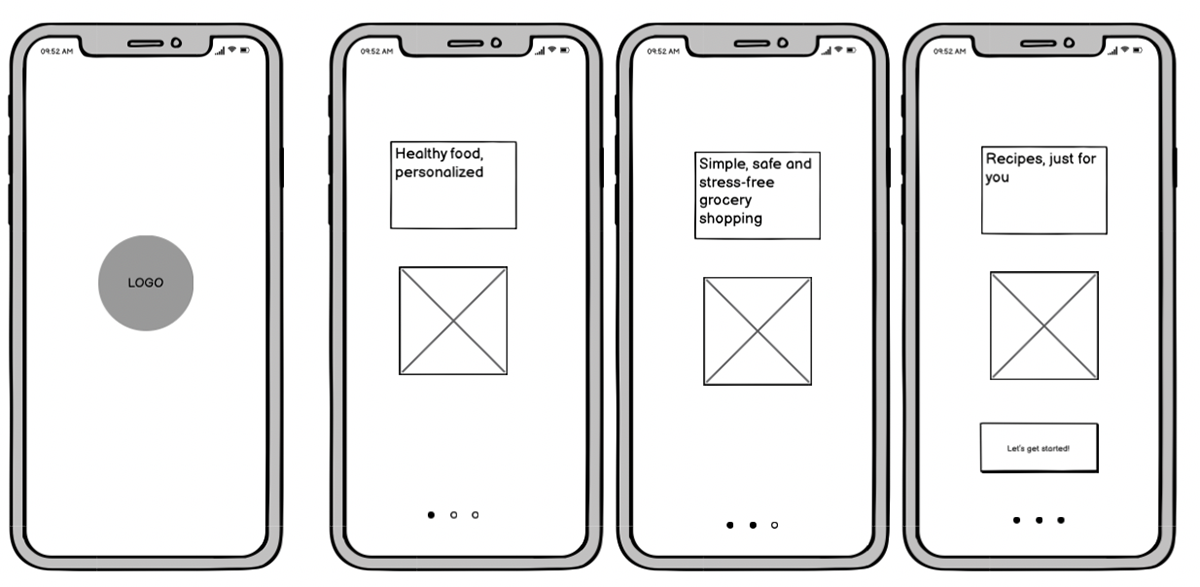
Splash + Onboarding

Landing Page
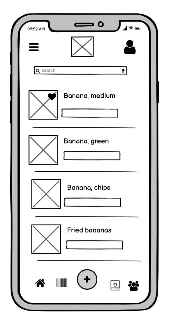
Search Food Page
PAPER PROTOTYPING
FEATURE 1 - Search Food Tool: This tool can be used with your phone, while on the web, the user can use the search food option to browse foods, and learn about healthier options
FEATURE 2 - Scan Food Tool: This tool can only be used with your phone, while on the web, the user can use the search food option to browse foods, and learn about healthier options
FEATURE 3: Browse Food Tool - This tool can be used with your phone and website, and it's helpful in case you want to find information in something you can't scan, such as fruits and vegetables
MID-FIDELITY WIREFRAMES
- Figma was used to digitalize the mid-fidelity wireframes and iterate an improved design solution
- The goal is to have the high-fidelity prototypes further communicate functionality by providing more detail and precise UI placement to have a more visual feel and look for the Olive app
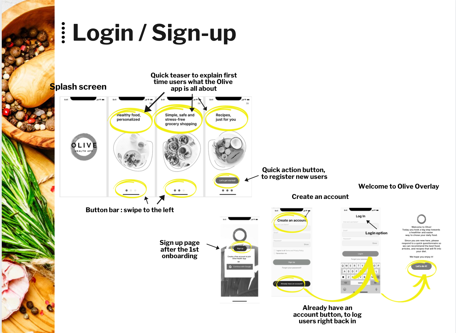
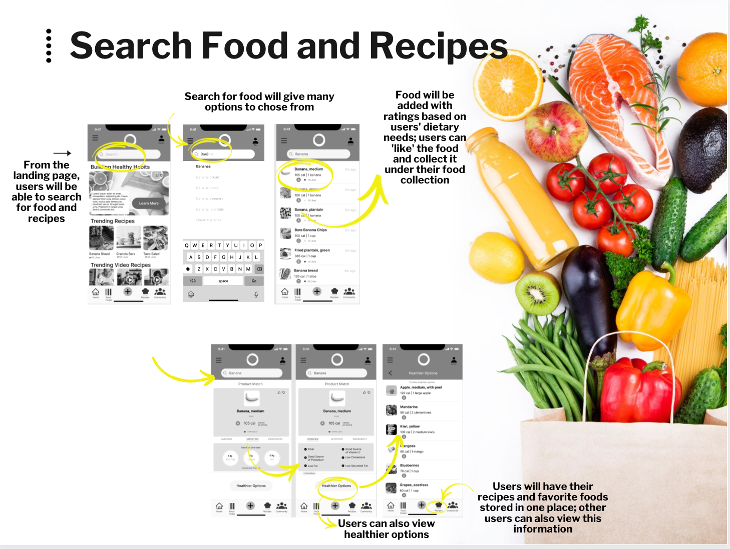
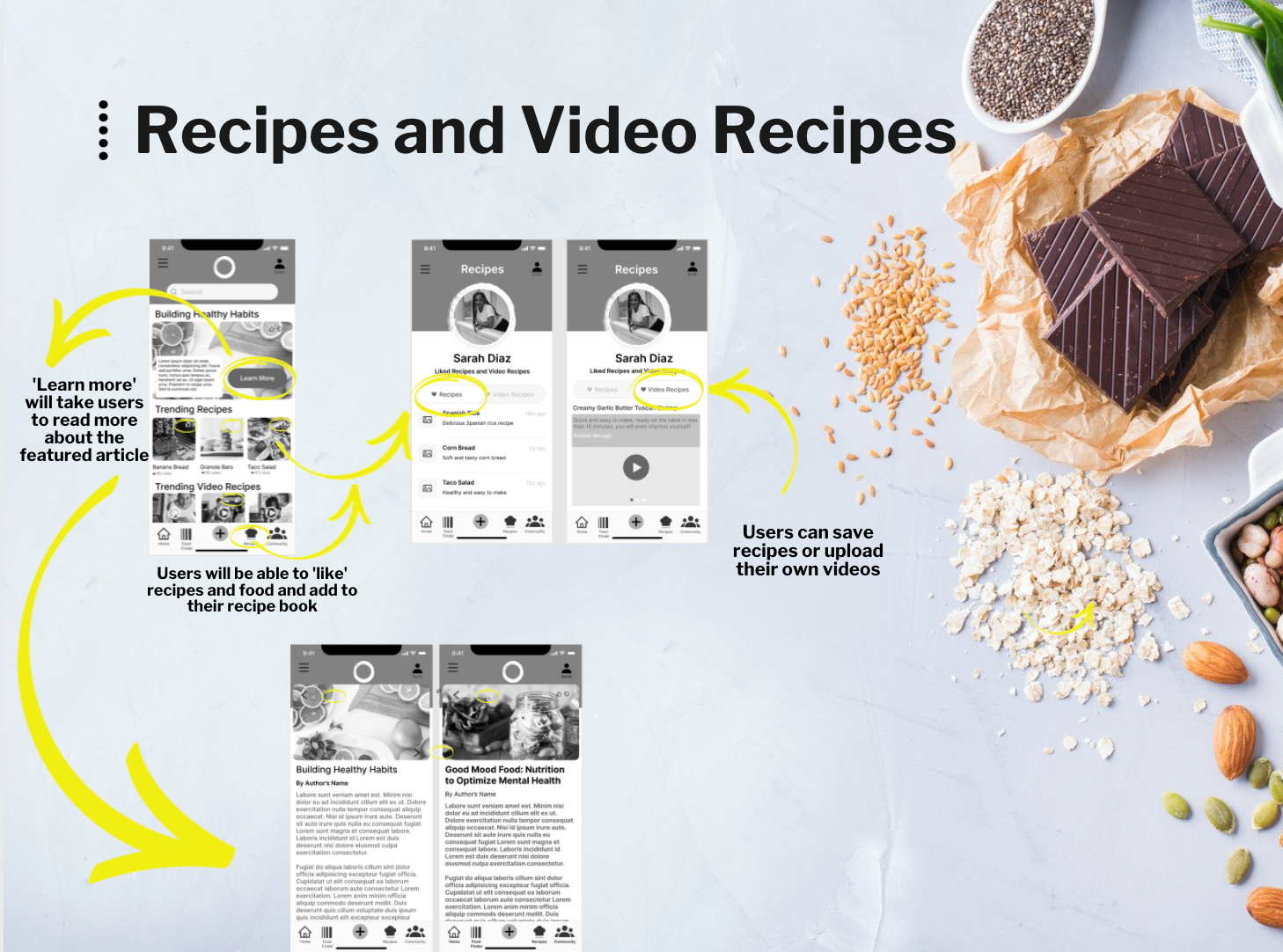
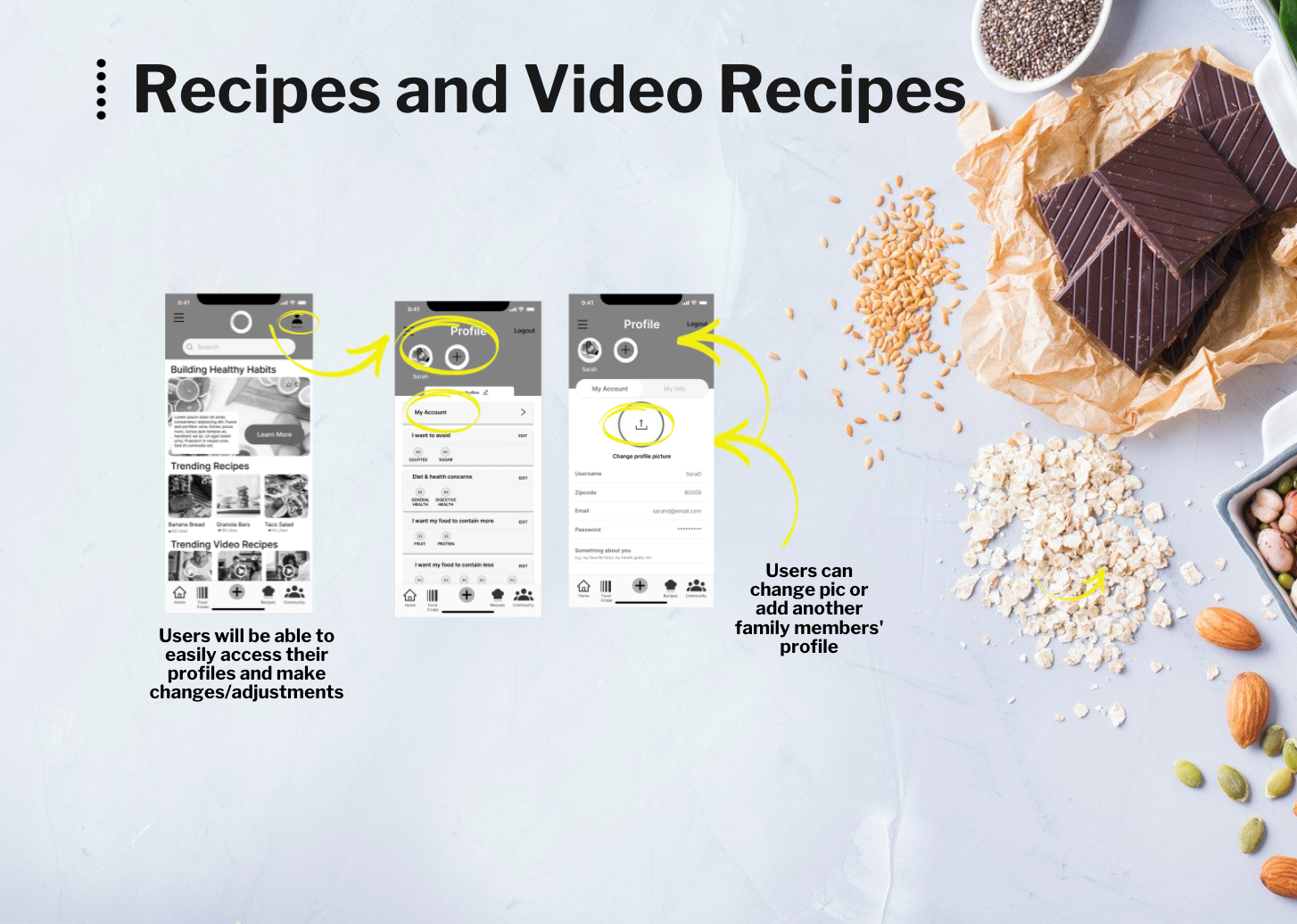
USABILITY TESTING
- The study consists of 5 participants recruited through friends, family, and social media platforms such as Slack
- The target users were the ones that either have previous experience with health apps or have a health condition and want to eat healthier
GOALS
- Assess the utility and usability of Olive for new users on mobile devices
- Assess the length of time and the number of pages that take a user to perform specific tasks
- The stress level of the users during the execution of tasks
- Observe and measure if users understand the app, its value, and how to complete essential functions such as signing up and adding recipes
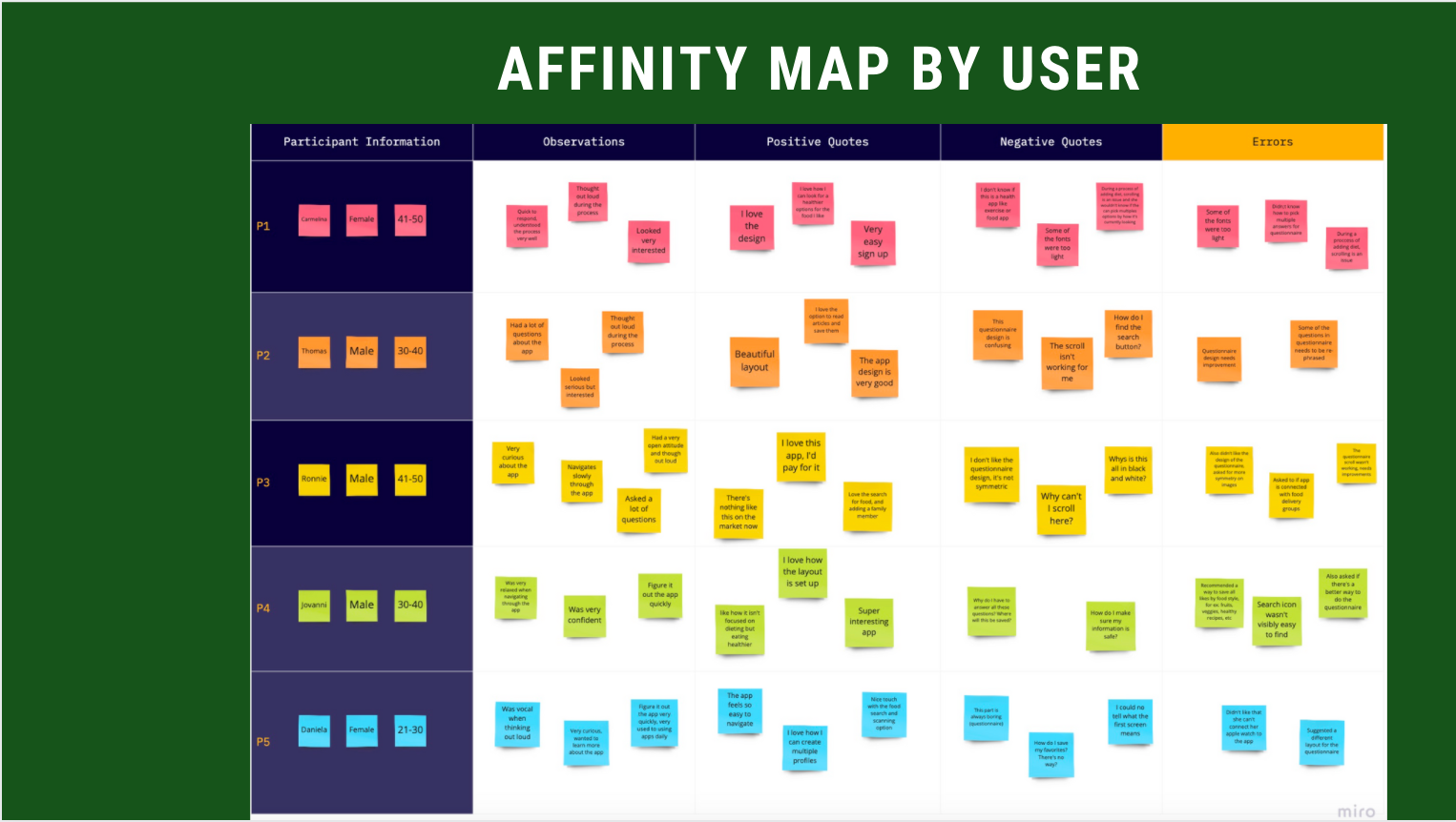
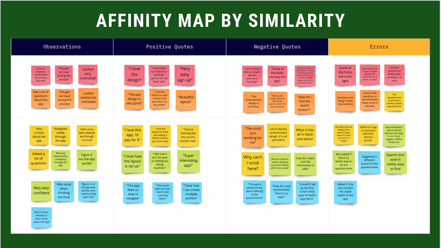
RESULTS
- Participants liked the app idea and mentioned they would use it daily
- They found it very easy to navigate and find information
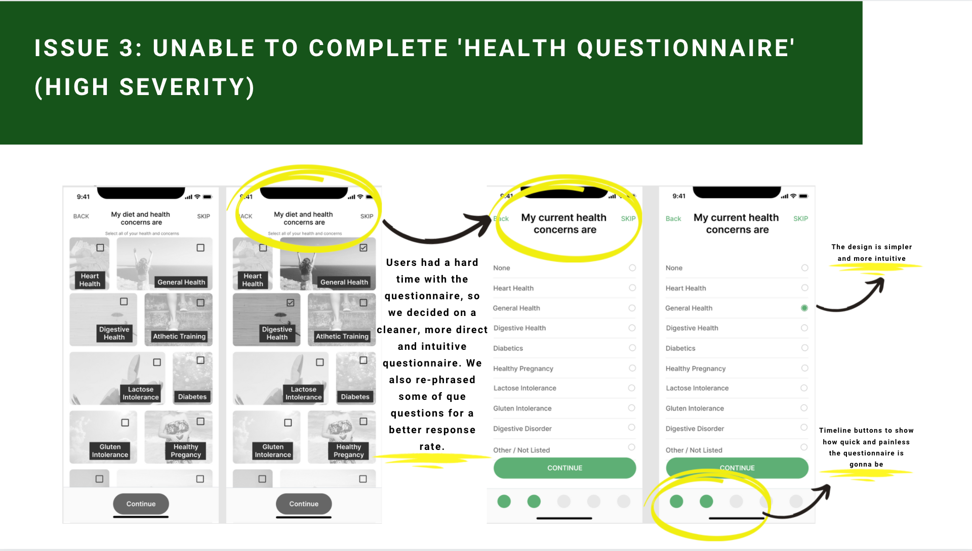
- Users had difficulty understanding the questionnaire due to the non-intuitive design and lack of descriptions or instructions
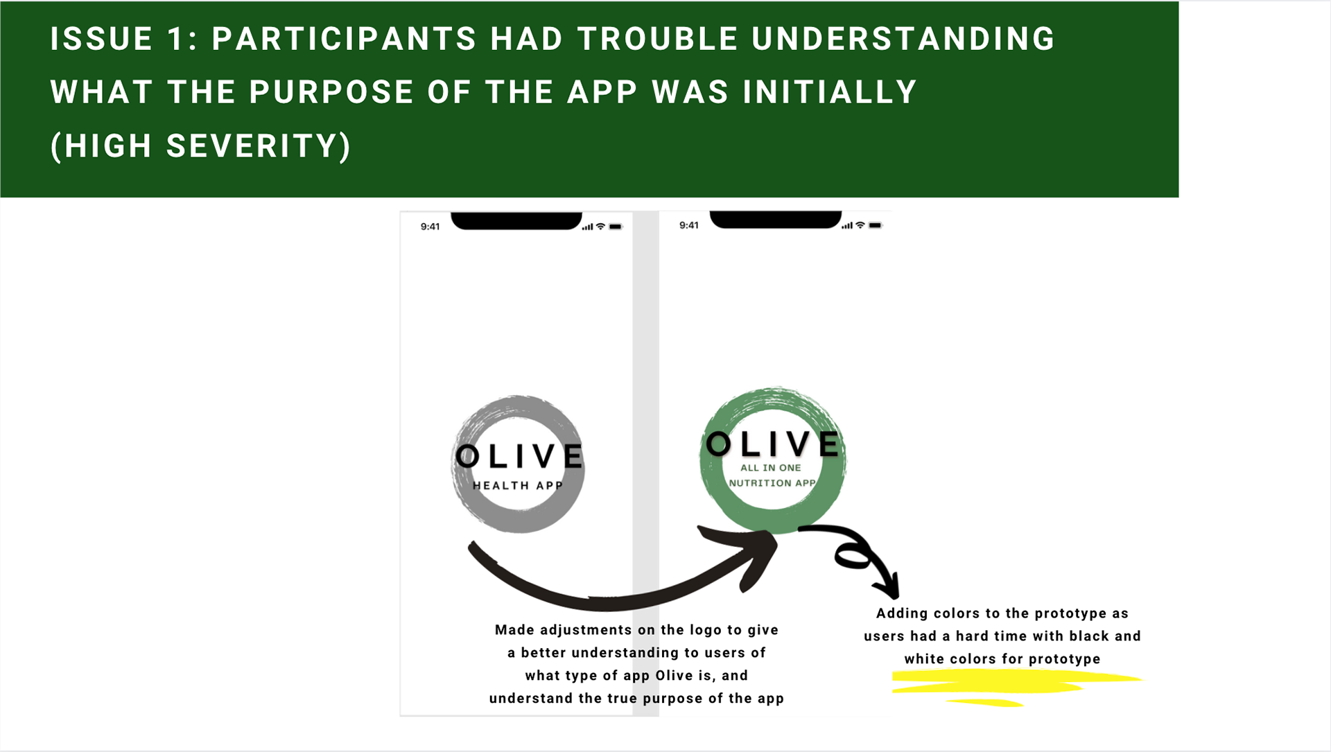
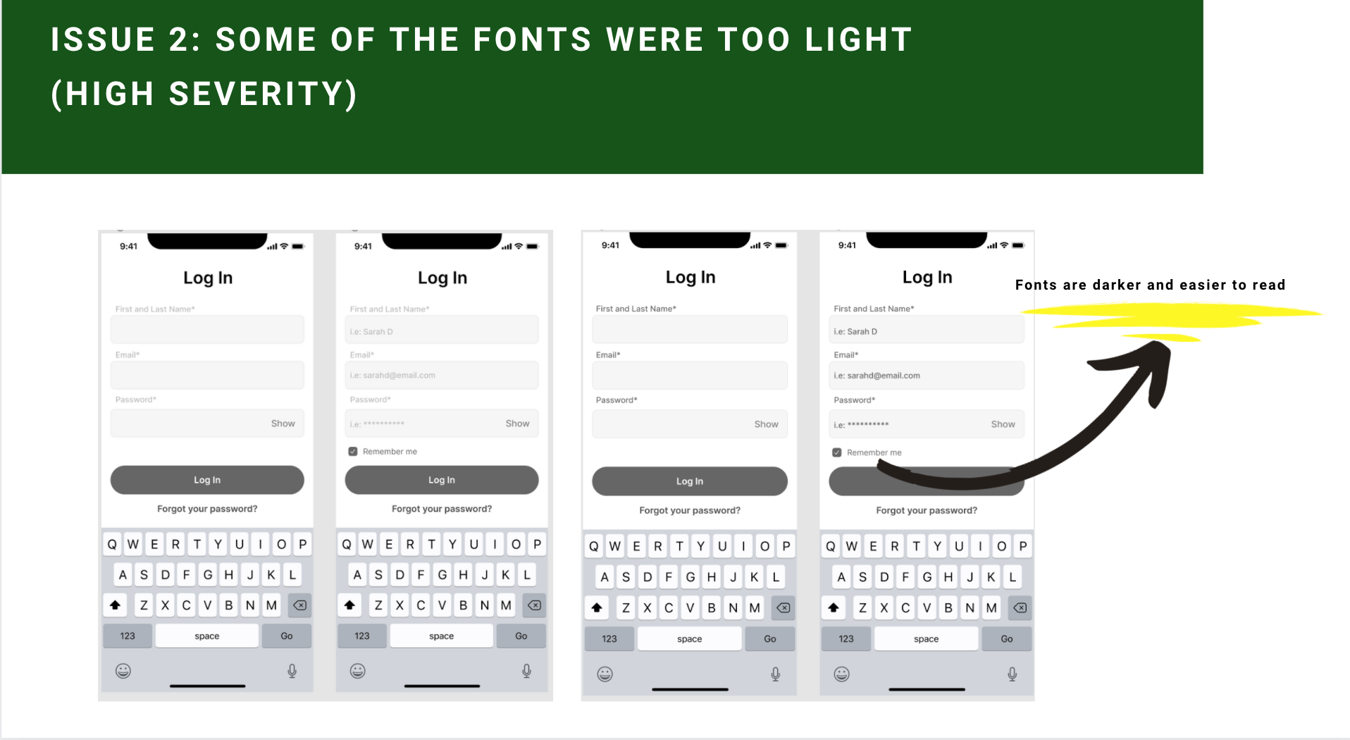
- By listening to all the participants' feedback and making adjustments accordingly, Olive is becoming a more user-centered app
PREFERENCE TEST
Objectives: Determine which pre-sign-up screens are more appealing and engaging for the participants.
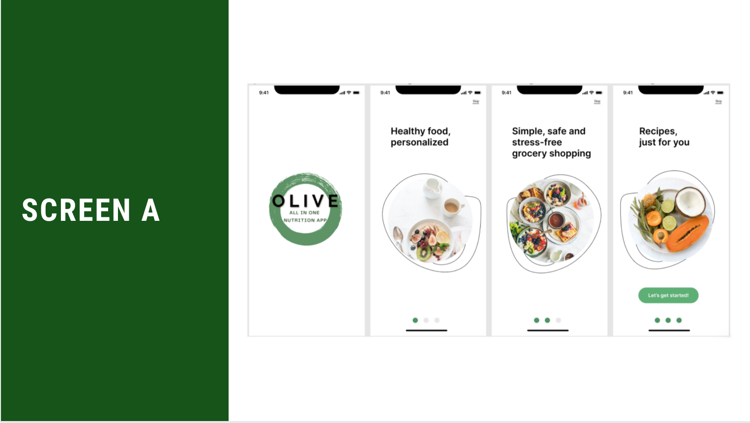
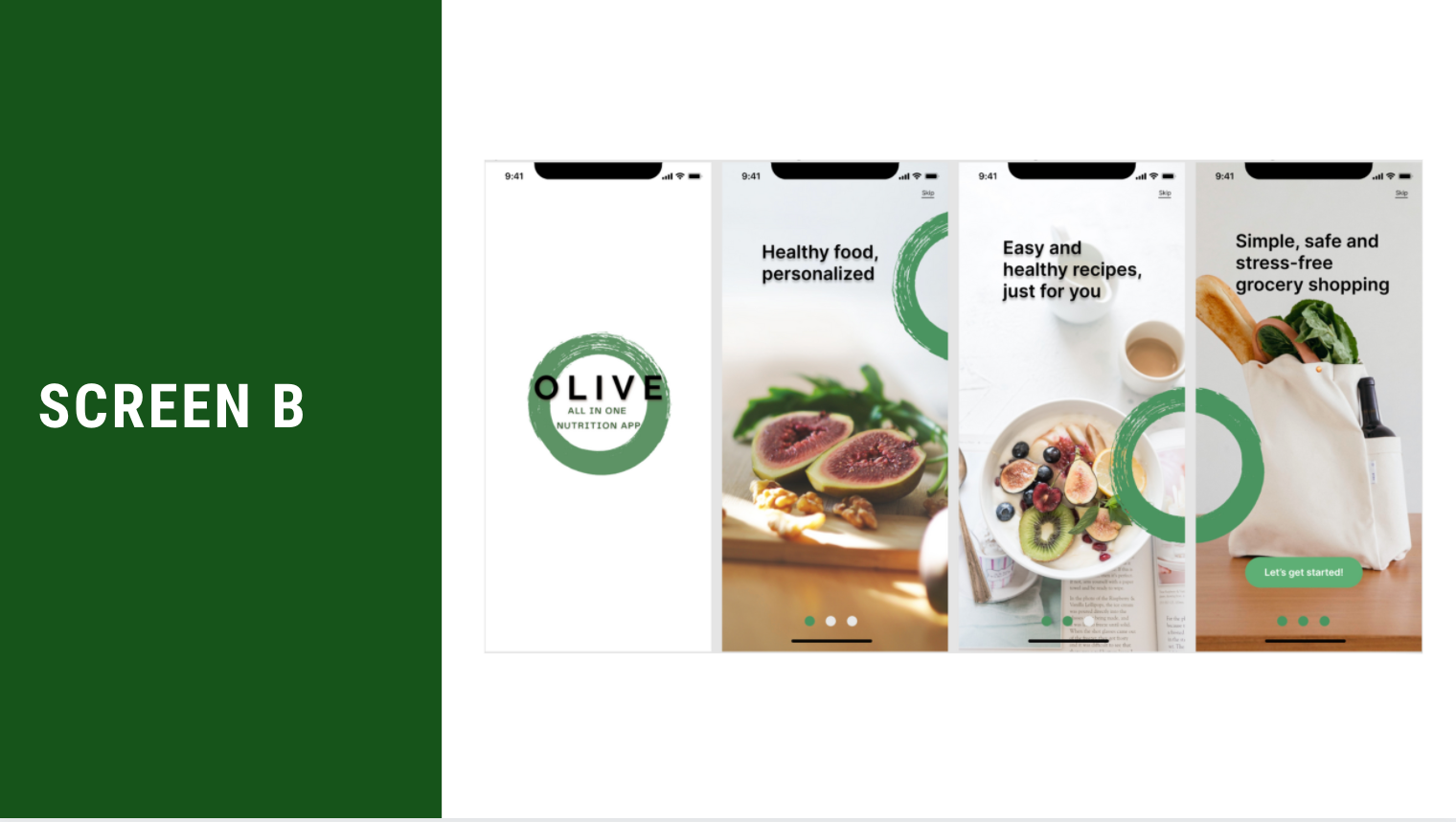
Methodology: A preference test was conducted using Usability Hub. I uploaded two screens but the same content, both with different styles, photos, and sizes. The participants were asked to choose which one they liked best between screens A and B.
Participants: Thirty participants took part in the test.
RESULTS
There was a significant difference between the two screens, with most users opting for test B—the screen with larger images. This option had 77% of the total responses, with a much higher chance of performing better. I will be updating my prototype with this option moving forward.
TAKEAWAYS
- Always test the product, and conduct user interviews as many times and as much as possible
- Iterate, iterate, iterate
- Discuss with the team as many times as possible, preferably in an Agile environment